


When was the last time you really looked at a banknote?
For most of us, cash has become background noise. We tap our phones, pay with our watches and rarely stop to appreciate one of the most carefully considered pieces of design we interact with every day.
That might be about to change.
I'm Pedro Gião, Graphic Designer at Berlew in Nottingham. The European Central Bank (ECB) has unveiled ten shortlisted proposals for the next generation of euro banknotes, the first major visual redesign since 2002 and a rare public brief aimed at more than 350 million people: something beautiful, secure, accessible and instantly recognisable.
For designers, it's a reminder that even the smallest everyday objects carry enormous responsibility.
More than just a pretty note
It's easy to assume the redesign is simply about refreshing the look and feel. In reality, aesthetics are only one part of the brief.
The ECB's next generation of banknotes has to balance shared identity, accessibility, security, sustainability and familiarity at once. The shortlisted proposals all answer that same multi-layered brief, not a cosmetic refresh.
That's a balancing act many designers will recognise.
Whether you're designing a website, a brand identity or a physical product, the challenge is often the same: evolve without alienating your audience.
The ECB brief
Five jobs the next euro notes have to do
Five constraints every shortlisted proposal has to satisfy.
-
Shared identity
Reflect Europe as a connected whole, not a single country's aesthetic.
-
Accessibility
Readable type, clear denomination markers and contrast that works for users with visual impairments.
-
Security
Advanced anti-counterfeiting features integrated without breaking the visual system.
-
Sustainability
More responsible production choices for a series that will circulate for years.
-
Familiarity
Retain colour coding and structure people already associate with euro notes.
Designing identity at continental scale
One of the most interesting aspects of the proposals is the choice between two very different themes.
The first, European Culture, celebrates six influential figures: Maria Callas, Ludwig van Beethoven, Marie Curie, Miguel de Cervantes, Leonardo da Vinci and Bertha von Suttner. Each denomination pairs a cultural icon with scenes of everyday European life, such as libraries, schools and public performances. (European Central Bank)
On paper, it feels safe. Familiar. Even expected.
The Culture theme has a practical case too: portraits and everyday scenes read quickly, and continuity matters when you are redesigning something people handle without thinking. That legibility is not nothing.
But the more I look at it, the more I struggle with the idea that Europe's identity can, or should, be distilled into six historical figures.
Europe is not a closed narrative of "great individuals." It is a living, shifting, multilingual system of cultures, migrations, and overlapping histories. Reducing that complexity to a handful of important names risks reinforcing a version of Europe that feels selective rather than inclusive.
Which is why the second theme proposal, Rivers and Birds, feels so much more honest.
This theme replaces people with natural systems: rivers that cross borders, birds that migrate freely across the continent, landscapes that refuse to be contained by political lines. The reverse of each note still acknowledges European institutions, but the emotional language is rooted in something far more universal, nature, movement, and connection.
And that, to me, is what makes it powerful.
Rivers do not stop at borders, and birds migrate without passports. In a time where Europe is constantly negotiating identity, migration, and unity, this feels like a more truthful metaphor for what actually connects us.
Below: two 20€ proposals from the ECB shortlist, one under each theme.
Two themes
European Culture vs Rivers and Birds (20€ proposals)
-
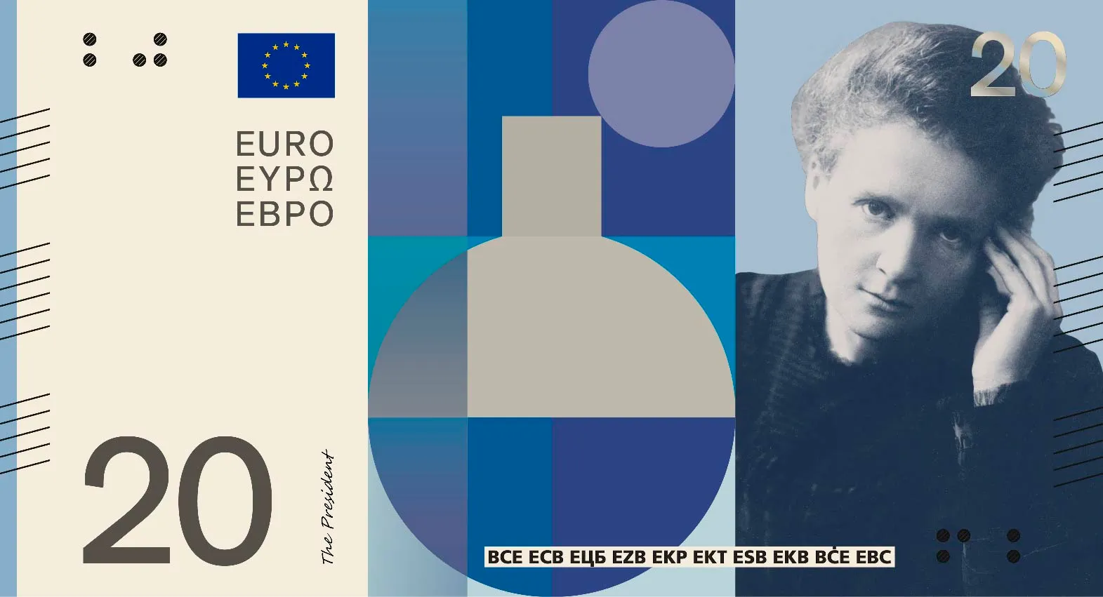
Design C, European Culture (Neue Gestaltung GmbH) -
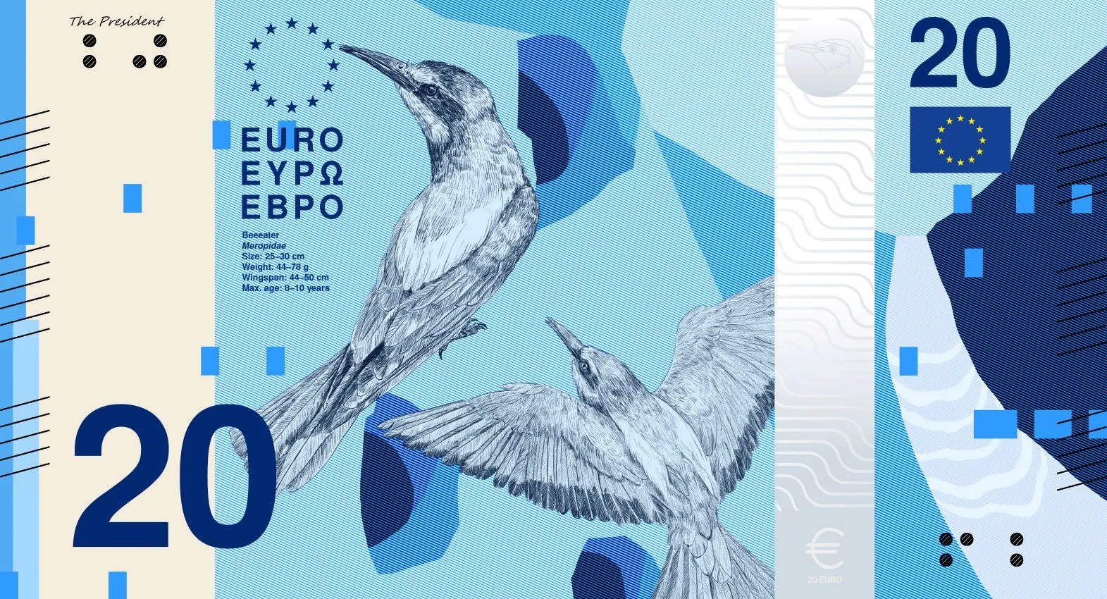
Design B, Rivers and birds (PunktFormStrich)


Images: ECB future euro banknote design proposals. Design proposals for a possible future series, not final banknotes. Source: European Central Bank.
Why the nature theme works better (at least for me)
We often talk about "shared identity" in design as if it's something you can illustrate directly. But shared identity is rarely about representation, it's about recognition.
And I find it difficult to believe that everyone in Europe will feel represented by six historical figures, no matter how carefully chosen they are.
The nature theme avoids that problem entirely.
It doesn't try to represent Europe through individuals. Instead, it represents Europe through systems, things that already exist across all countries, regardless of language, politics or culture.
In a way, it's a more democratic approach to symbolism.
It doesn't ask, "Who do you identify with?" It asks, "What do we all share?"
My favourite proposal: Design H
Among all the shortlisted designs, Proposal H stands out to me the most.
What I appreciate about it is its restraint.
Rather than overloading the banknotes with decorative detail, it leans into clarity and rhythm. The illustrations feel intentional but not dominant. The composition gives space for the security features and typography to breathe, which is something many of the other proposals struggle with.
There's also a subtle confidence in how it handles the natural theme. The birds and rivers aren't treated as literal illustrations, they feel more like movement systems across the notes. That continuity is easier to see when you look at the full series from 5€ to 200€: each denomination shifts the landscape and bird species, but the rhythm of water, typography and colour holds the set together.
It's a small detail, but it matters. The best design systems don't just work individually, they work collectively.
And Proposal H feels like it understands that.
Proposal H
Design H, Atelier Goppel-Toperngpong
-
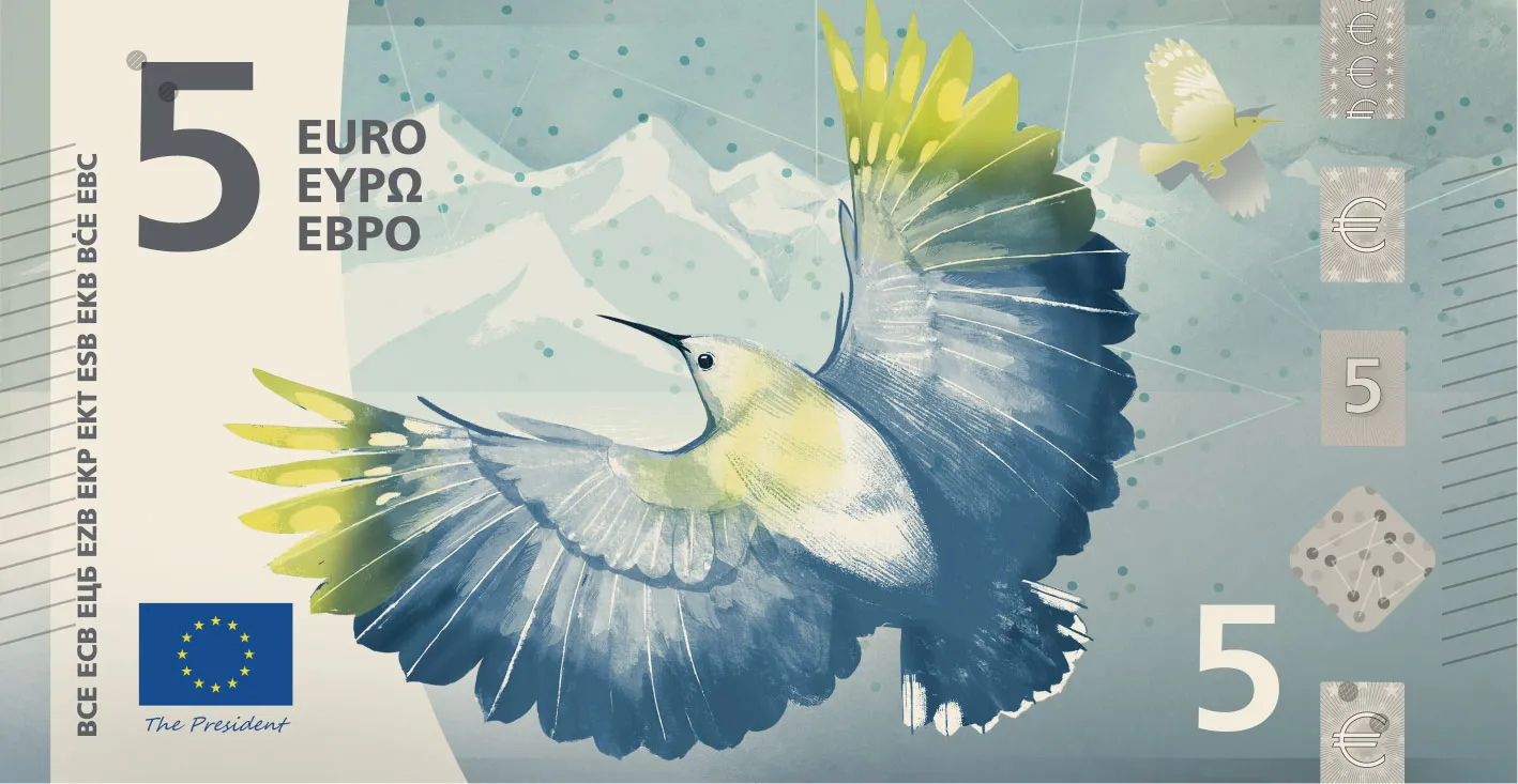
5€, Design H (ECB design proposal) -
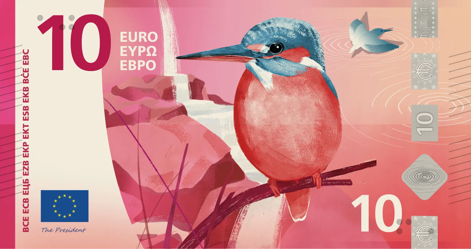
10€, Design H (ECB design proposal) -
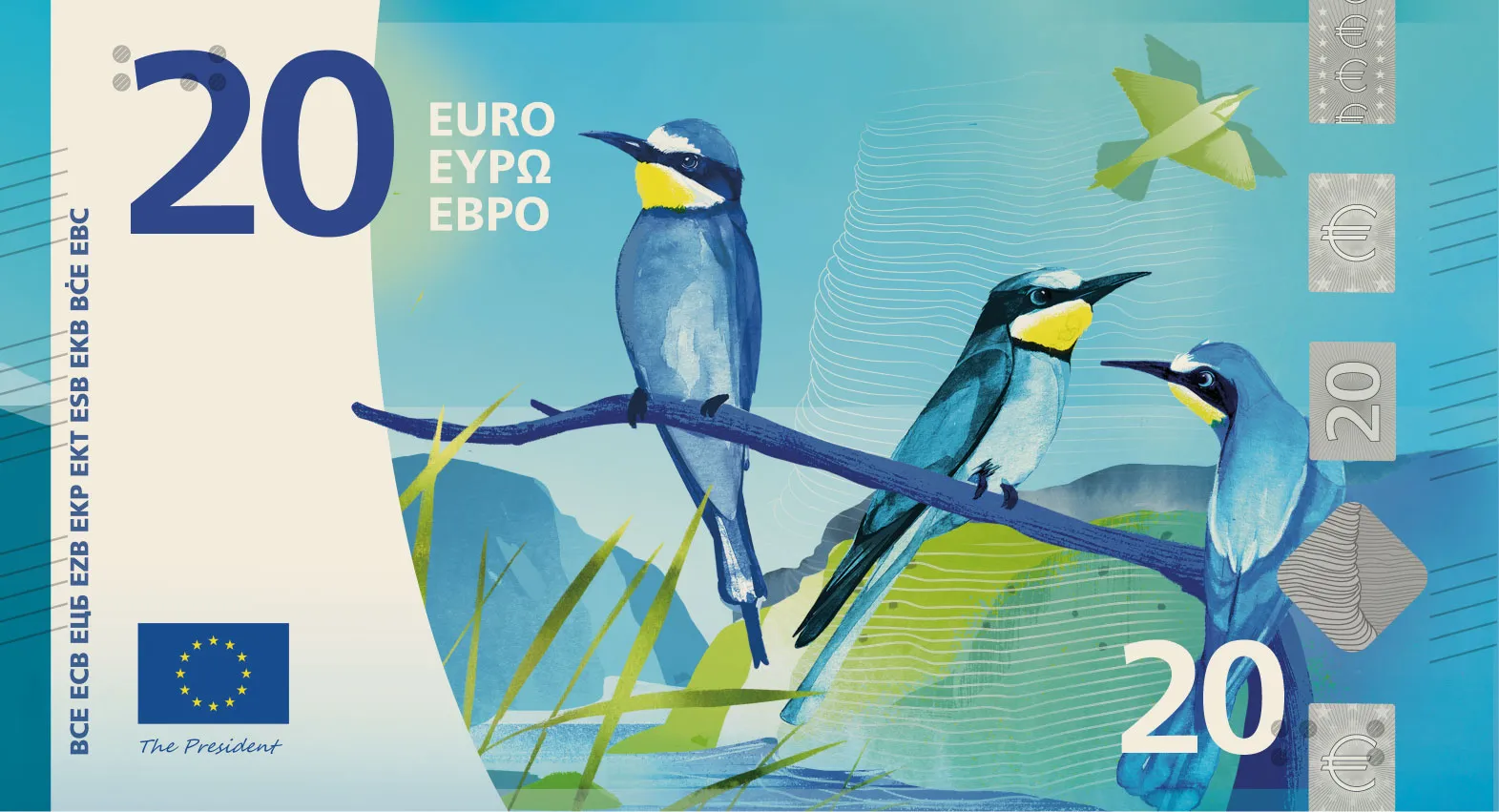
20€, Design H (ECB design proposal) -
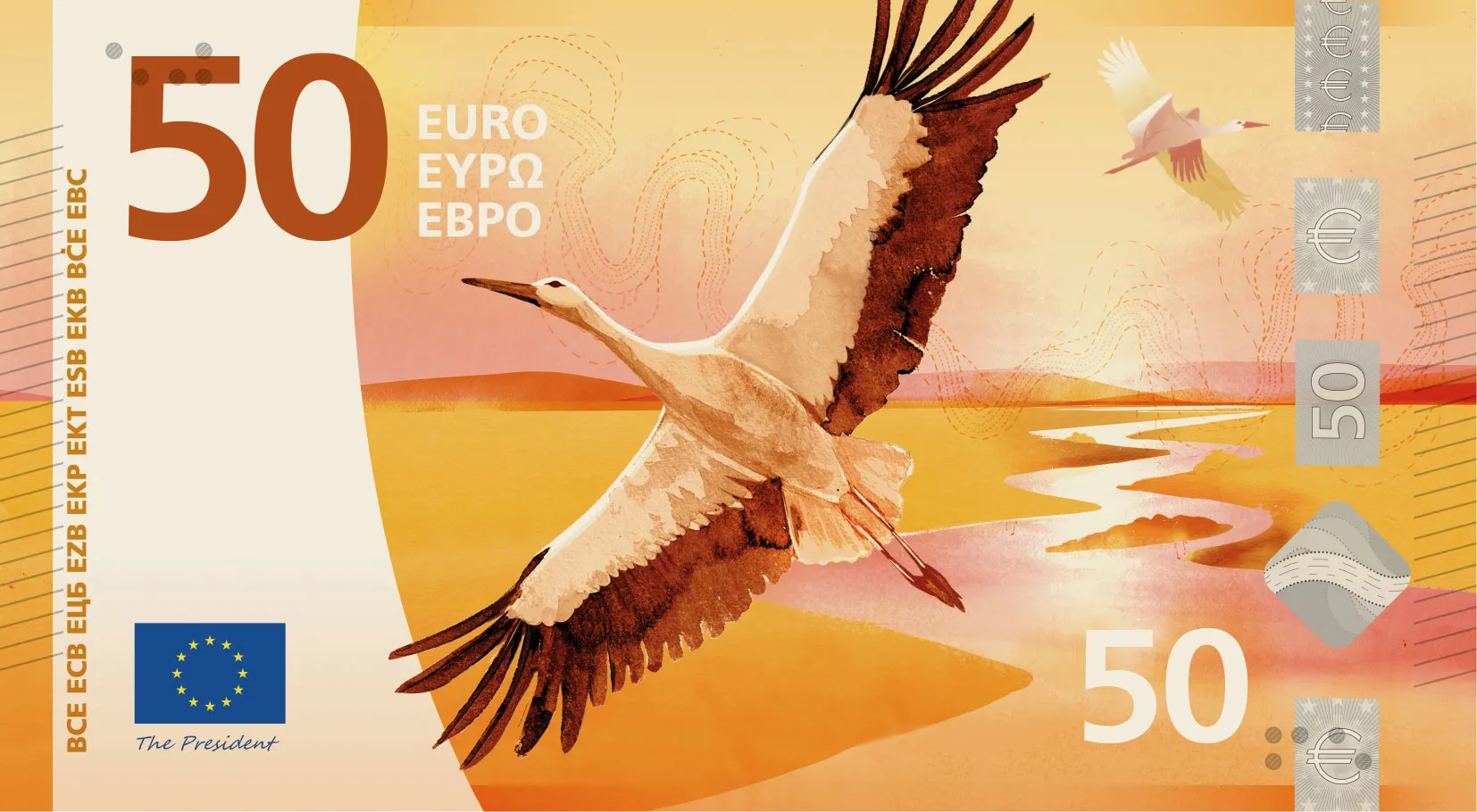
50€, Design H (ECB design proposal) -
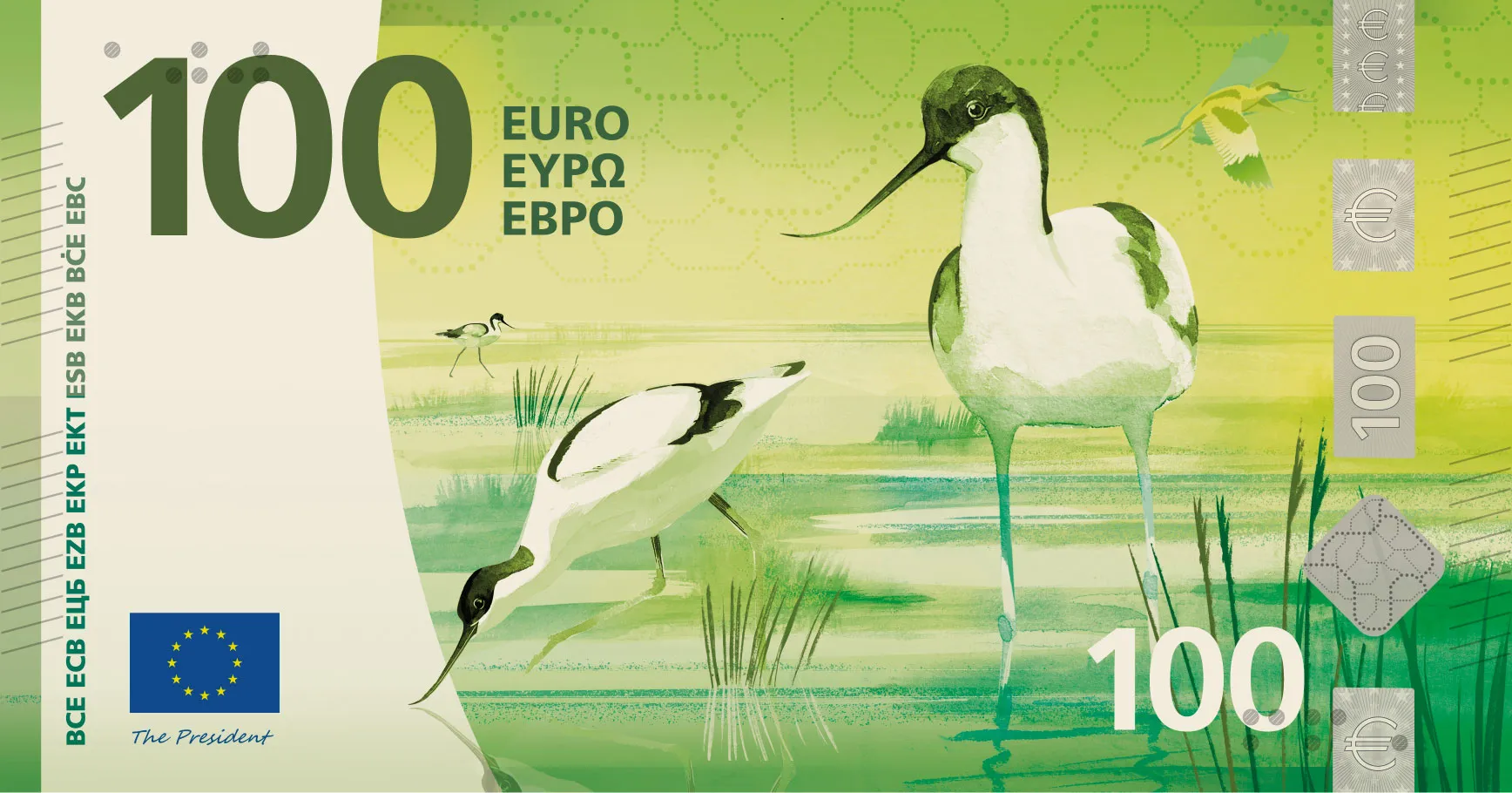
100€, Design H (ECB design proposal) -
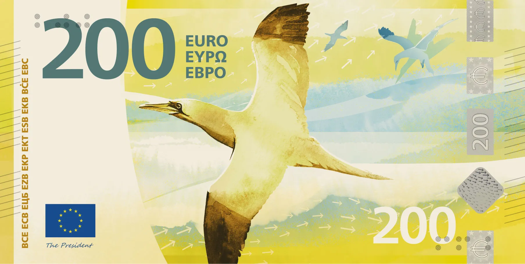
200€, Design H (ECB design proposal)


Images: ECB future euro banknote design proposals. Design H by Atelier Goppel-Toperngpong. Source: European Central Bank.
Designing for everyone means designing inclusively
Perhaps the biggest takeaway isn't what appears on the notes, but who they're designed for.
Unlike many branding projects, these banknotes cannot target a specific demographic.
They need to work equally well for young adults and pensioners, tourists and locals, people with visual impairments and those handling cash every day in busy environments.
Every design decision has to earn its place. The new banknotes will build on accessibility features already familiar to euro users, including distinct colour palettes for each denomination, increasing note sizes, raised tactile elements for people with visual impairments and clear, high-contrast denomination numerals. Rather than treating accessibility as an afterthought, the ECB has made it one of the core objectives of the redesign, alongside security and sustainability. See the ECB's accessibility features for visually impaired people for how the current series works in practice.
Colour, illustration style, hierarchy, denomination markers and contrast ratios all have to support usability first. That is the same discipline we apply when building accessible brand colour palettes for web and print: pairs that pass, hierarchy you can read in a hurry.
It's a useful reminder that good design isn't just about expression.
It's about removing friction.
Inclusive design at scale
-
No single user
-
Contrast first
-
Friction out
Familiar, but noticeably different
One of the hardest parts of redesigning something iconic is deciding how much to change.
Move too far and people lose recognition.
Change too little and the redesign feels pointless.
The proposals strike an interesting balance. They introduce contemporary illustration styles, refreshed compositions and more expressive imagery while retaining the colour coding and denomination structure people already associate with euro notes.
This is the same challenge brands face when modernising a long-established identity.
The strongest redesigns don't erase history, they build on it. The same question applies to logo versus full brand identity: evolve the system, not just the symbol.
Should the public influence design?
Another notable aspect of the project is the process itself.
Rather than selecting a design behind closed doors, the ECB has opened the shortlisted proposals to public consultation before making a final decision later this year. More than 1,200 designers initially applied, with 25 invited to develop concepts before an independent jury shortlisted the final ten. (European Central Bank)
It's an interesting reminder that design doesn't exist in isolation.
Great design solves problems, but it also needs acceptance from the people who will ultimately use it.
Final thoughts: and your turn to decide
What I find most interesting about this entire process is that it forces us to ask a simple question:
What should Europe feel like?
Is it a collection of cultural icons from history books? Or is it something more fluid, more connected, and more alive, like rivers and birds moving freely across borders?
Personally, I lean strongly toward the second interpretation. There is something grounding about returning to what physically connects us all: nature.
But that's just my perspective.
The ECB is currently inviting public feedback on the shortlisted designs, with voting open until early September 2026.
So the question is no longer just what the euro should look like.
It's what kind of Europe we want it to represent.
Which design would you choose? If you vote in the survey, we'd be curious whether designers pick differently from the general public.
Euro banknote redesign FAQs
What are the ECB's new euro banknote design proposals?
The European Central Bank shortlisted ten design proposals for the next euro banknote series, the first major visual update since 2002. Two themes frame the work: European Culture (historical figures and everyday cultural scenes) and Rivers and Birds (natural systems that cross borders). Full proposals are published on the ECB site with front and reverse views for each denomination.
What is the Rivers and Birds theme on the new euro notes?
Rivers and Birds replaces portraits of historical figures with natural imagery: rivers flowing across borders and bird species associated with European landscapes. The reverse of each note still references EU institutions, but the front uses nature, movement and connection as the shared symbolic language.
What is Design H in the ECB banknote proposals?
Design H is a shortlisted proposal by Atelier Goppel-Toperngpong under the Rivers and Birds theme. It uses restrained illustration, clear typography and a sense of continuity across denominations: birds and rivers read as movement systems rather than literal decoration.
Can the public vote on the new euro banknote designs?
Yes. The ECB opened a public consultation on the shortlisted proposals before selecting a final design. Feedback is collected via the ECB survey, open until early September 2026, alongside the design gallery on the ECB website.
When does the ECB euro banknote consultation close?
Public feedback on the ten shortlisted designs is open until early September 2026 via the ECB survey at surveys.ecb.europa.eu. The Governing Council is expected to decide on the final visual appearance around the end of 2026, with production and circulation following several years later.
What accessibility features do euro banknotes use?
The current Europa series uses multiple cues: larger physical size for higher denominations, distinct colours per value, large contrasting numerals and tactile raised lines on the edges so users can identify notes by touch. The ECB consulted the European Blind Union during development and the future redesign brief calls for further improvements to inclusion and accessibility.
What can graphic designers learn from the euro banknote redesign?
The project shows how identity, accessibility, security and familiarity must be balanced when designing for hundreds of millions of users. Colour, hierarchy and denomination markers are usability tools first. The same discipline applies to brand systems and web design at any scale.


